

Overview
Overview
Overview
At Fidelity Investments, I worked as the lead User Experience Designer for the Financial Account Information squad, responsible for the positions page on Fidelity's B2B2C web app, Wealthscape—a platform that enables financial advisors to view and manage their clients' portfolios in one place.
One of my key projects was redesigning the legacy positions page, which required users to navigate multiple pages to access essential information like quotes, charts, and news. The old design also struggled with accessibility issues and data overload.
To improve usability, I proposed a new "Research" page that consolidates three separate pages into one, streamlining access to critical data. Usability testing would determine whether the new design enhances efficiency and user experience or if elements from the legacy structure should be retained
Role
User Experience Designer
Goal
Goal
Goal
Rather than have a user click into several different links to view a detail about a position, we want to improve the previous legacy experience by combining all research details into one modal layer. This way a user can open less pages and find information faster in one place. Usability testing will give us insight on user needs and opinions on new design.
About Unmoderated Usability Testing
About Unmoderated Usability Testing
About Unmoderated Usability Testing
What this methodology is
What this methodology is
Unmoderated, task-based studies with a large panel of participants using a higher fidelity prototype or pre-login live site. Provides video and audio while they perform the tasks.
When and why this methodology is used
When and why this methodology is used
Most effective late in the design process and used to understand what the general user population thinks is and isn't working about certain designs.
How the results are used
How the results are used
Findings identify what problems or questions, if any, participants have about specific designs or concepts. The product team can use the results to identify areas of improvement to target in later iterations.
About Unmoderated Usability Testing
About Unmoderated Usability Testing
Right Problem
Right Problem
Identify, understand, and quantify experience quality and customer/user unmet needs
Right Solution
Right Solution
Evaluate usefulness and problem-solution fit of new product and feature concepts
Done Right
Done Right
Measure and improve the usability of design solutions
Minimum Viable Product
Minimum Viable Product
Minimum Viable Product
Final Concept
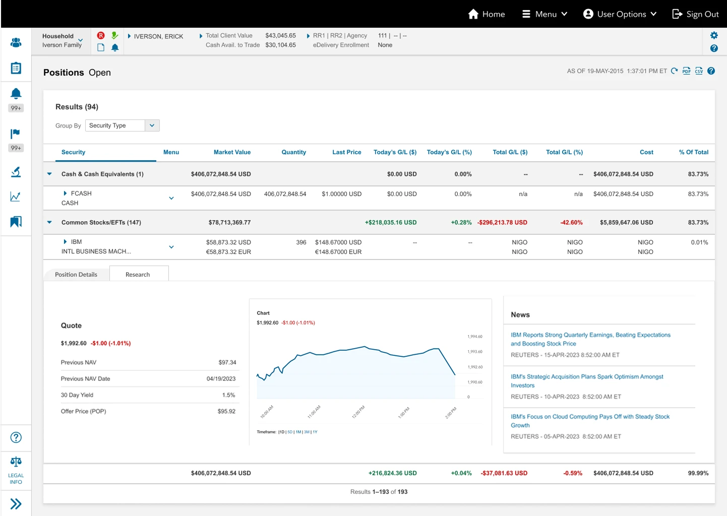
Positions landing page
Clicking on a menu dropdown icon will open a contextual menu modal
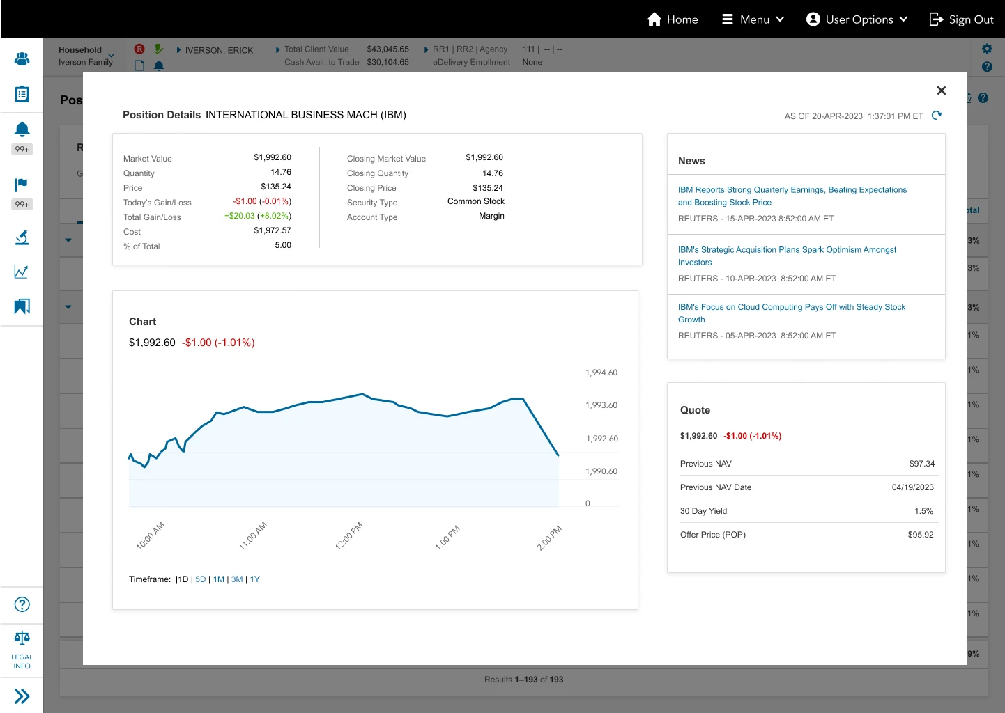
Clicking on "Position Details" will open the new details modal layer

Final Concept
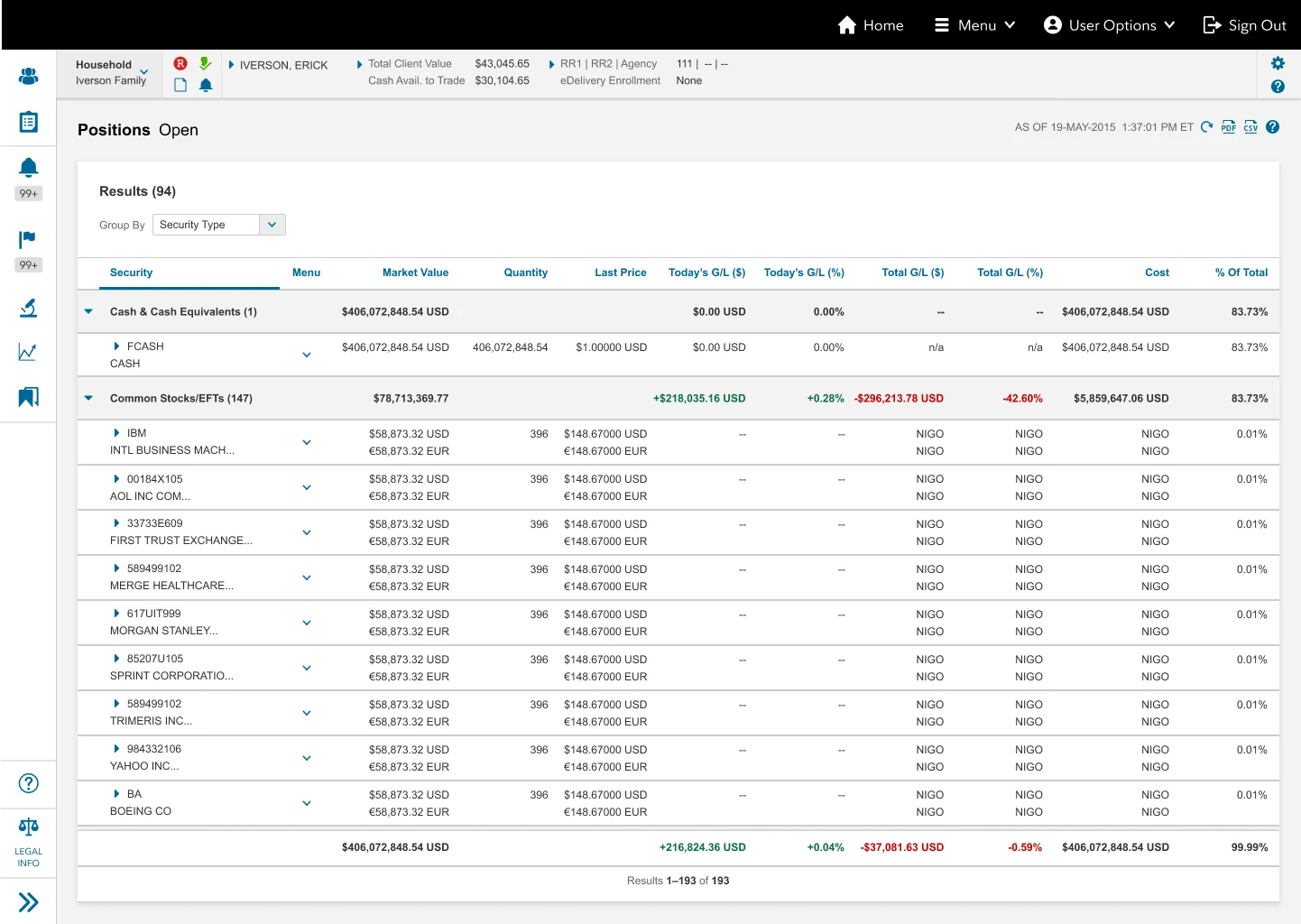
Positions landing page
Clicking on a menu dropdown caret icon will open a contextual menu modal
Clicking on "Position Details" will open the new details modal layer
Clicking on "Position Details" will open the new details modal layer
Result Summary

2 out of 5 participants had trouble finding the information asked because of labels.
"So as someone who has some knowledge behind it, but not a whole lot and I wouldn t call myself an expert, it is a little bit harder for me to identify exactly where I would need to go and I feel like I would need to do a lot of guess and checking, just to make sure I'm clicking on the right thing." -Participant 3
When looking for individual information such as just "news", 2 participants thought that they were looking for a page labeled that way. Most participant knew to go to "Position Details".

4 out of 5 participants wanted a chart that would go further back in timeline
"Beyond just the standard five days, one month, three-month, one year, if I wanted to look about the past six years or beyond one year or two to kind of, again, get that bigger picture view, I feel like that would be really helpful as well." participant 3
Good insight on what participants want to see on the visualization chart. participants wants to see further back in time.

Some confusion on what the down caret did, but most participants knew to try and click there first to find a menu
"A little confusion between the downward caret and arrow on how to expand it but my guess was pretty close" -Participant 5
Participants know to look for a menu to look for details, some had trouble with the difference between the down caret for menu and the arrow next to the security name. Those who had trouble clicked the menu down caret first.
Result Summary
2 out of 5 participants had trouble finding the information asked because of labels.
2 out of 5 participants had trouble finding the information asked because of labels.
"So as someone who has some knowledge behind it, but not a whole lot and I wouldn t call myself an expert, it is a little bit harder for me to identify exactly where I would need to go and I feel like I would need to do a lot of guess and checking, just to make sure I'm clicking on the right thing." -Participant 3
"So as someone who has some knowledge behind it, but not a whole lot and I wouldn t call myself an expert, it is a little bit harder for me to identify exactly where I would need to go and I feel like I would need to do a lot of guess and checking, just to make sure I'm clicking on the right thing." -Participant 3
When looking for individual information such as just "news", 2 participants thought that they were looking for a page labeled that way. Most participant knew to go to "Position Details".
When looking for individual information such as just "news", 2 participants thought that they were looking for a page labeled that way. Most participant knew to go to "Position Details".
4 out of 5 participants wanted a chart that would go further back in timeline
4 out of 5 participants wanted a chart that would go further back in timeline
"Beyond just the standard five days, one month, three-month, one year, if I wanted to look about the past six years or beyond one year or two to kind of, again, get that bigger picture view, I feel like that would be really helpful as well." participant 3
"Beyond just the standard five days, one month, three-month, one year, if I wanted to look about the past six years or beyond one year or two to kind of, again, get that bigger picture view, I feel like that would be really helpful as well." participant 3
Good insight on what participants want to see on the visualization chart. participants wants to see further back in time.
Good insight on what participants want to see on the visualization chart. participants wants to see further back in time.
Some confusion on what the down caret did, but most participants knew to try and click there first to find a menu
Some confusion on what the down caret did, but most participants knew to try and click there first to find a menu
"A little confusement between the downward caret and arrow on how to expand it but my guess was pretty close" -Participant 5
"A little confusement between the downward caret and arrow on how to expand it but my guess was pretty close" -Participant 5
Participants know to look for a menu to look for details, some had trouble with the difference between the down caret for menu and the arrow next to the security name. Those who had trouble clicked the menu down caret first.
Participants know to look for a menu to look for details, some had trouble with the difference between the down caret for menu and the arrow next to the security name. Those who had trouble clicked the menu down caret first.
What We Learned
Results showed that most participants went to the "Position Details" page within the contextual menu to find quotes, news, and table visualization. All participants agreed that this page had all the information they would expect to need to learn more about an individual position. Some participants expressed the desire to dive deeper into prior history and the ability to go farther in time on the data visualization table.
Final Thoughts
Final Thoughts
What Worked?
What Worked?

Where Can We Improve?
Where Can We Improve?
